How We Increased Revenue by 6x for a Creative Business
We increased revenue by 6x by understanding user needs and reducing friction in the user journey.
By Marco Angelo
Share
Existing site challenges
The existing site was receiving a consistent volume of traffic, around 10,000 to 20,000 visits per month, but it had not been significantly updated since around 2010. As specialists in web design and e commerce in Newcastle upon Tyne, we identified that it was built on a legacy WordPress theme, with dated visual design and limited functionality.
While the site fulfilled its basic purpose, the user experience was cumbersome. Navigation was not intuitive, key information was difficult to scan, and common user actions required unnecessary effort.
The listing submission process also involved a large amount of manual work. Sellers completed a form, then separately sent images and payment details, often via email. This created delays, incomplete submissions, and additional administrative work for the business owner.
User-led research
Although there were clear areas for improvement, it was important to validate these assumptions with real users.
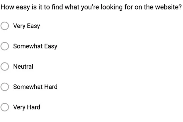
A short survey was implemented using Jotform and displayed as a modal on site entry. Given the existing traffic levels, this approach allowed for efficient collection of feedback without disrupting normal usage.
The survey focused on:
Why users visit the site
Which parts of the experience were frustrating
What users wanted to do more easily
a question from Jotform for Affairs of the HarpSurvey questions focused on user needs and pain points
Research outcomes
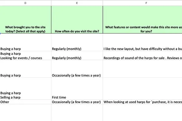
After approximately two weeks, around 30 responses were collected.
The results showed a loyal user base, with many respondents having used the site for several years. While users valued the platform, common issues emerged:
Difficulty browsing and comparing listings
Friction in the listings experience
The overall site feeling dated
Interest in richer content and supporting resources
These findings helped prioritise changes that would have the greatest impact.
Feature planning and implementation
Based on the research, a set of targeted improvements was planned and implemented. Drawing on our experience with web design and e commerce in Newcastle upon Tyne, we focused on creating a modern, user-friendly platform.
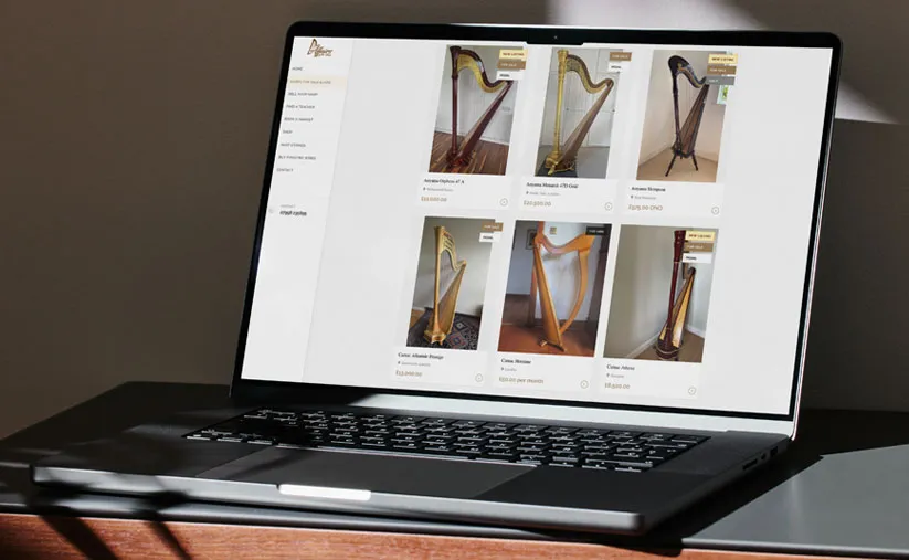
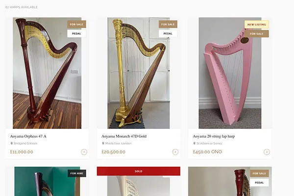
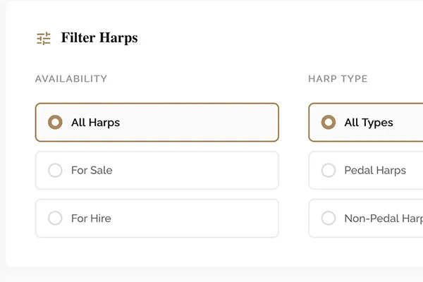
Improved listings page
The listings page was redesigned to make key information immediately visible. Each listing now includes a featured image, allowing users to quickly understand what is available and compare options more easily.
Redesigned listings page with featured imagesAdvanced filtering options for easier browsing
Homepage redesign
The homepage was updated to guide users directly to primary actions, such as browsing listings or submitting a harp for sale.
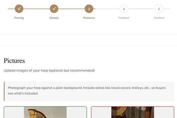
Streamlined submission flow
The "sell your harp" process was redesigned as a series of short steps rather than a single long form. Sellers can upload images directly and complete their submission in one flow.
Payments are handled via Stripe, reducing friction for sellers and removing manual payment follow-up.
Streamlined multi-step submission process
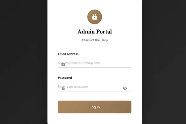
Custom admin interface
A bespoke admin panel was created to support the business owner's workflow. Submissions can be reviewed, valued, and published after payment, while retaining manual oversight where specialist expertise is required.
Custom admin panel for managing submissions
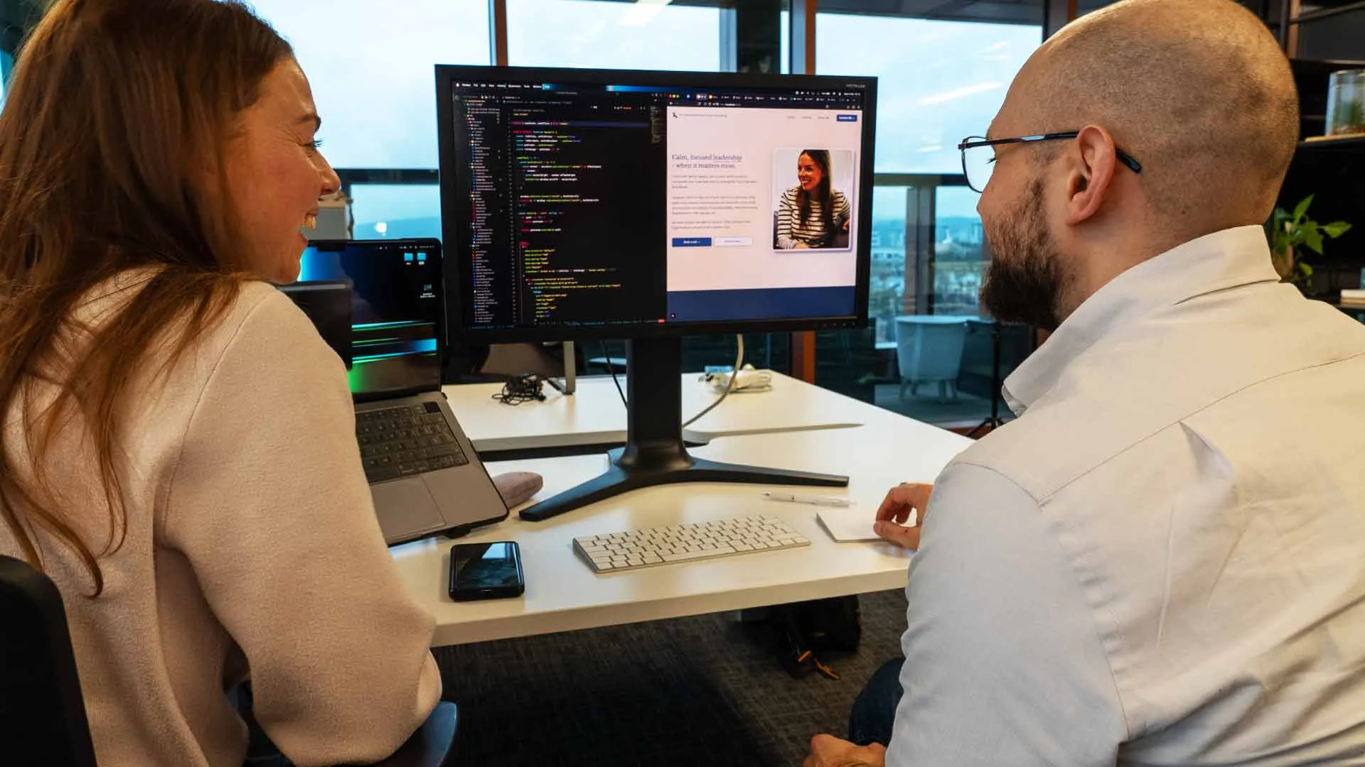
Technical delivery
The listings experience was rebuilt with an image-first approach. Each listing includes a high-resolution image carousel, with assets served via Cloudflare R2 to ensure fast loading and reliable delivery.
The website is built with Next.js to allow for easy future enhancements and scalability. Our approach to web design and e commerce in Newcastle upon Tyne emphasises performance and user experience at every level.
Results
Following the launch of the new site, user feedback was extremely positive. The improved listings experience, clearer user journeys, and reduced submission friction contributed to a 6× increase in sales.
Interested in seeing how Elevate North can help your business?